People want their Internet and they want it fast.
How fast, exactly? Nearly half of Americans say the ideal loading time for a web page is two seconds. Anything over and you’ll start losing visitors: over 40% of Internet users will close a page that fails to load in three seconds, and a one-second delay can bring down customer satisfaction by as much as 16%.
Improve your website’s speed and responsiveness to give your visitors a better user experience. Here are 4 Ways To Improve Your Site’s Response Time.
1. Accelerated Mobile Pages
An Accelerated Mobile Page or AMP is an HTML page that uses technical approaches to trim down code and content.

AMPs work by getting rid of unnecessary content from a website. All the site’s components–images, plugins, videos, applications–are compressed so that content is delivered faster and more efficiently. Often, important content is delivered first followed by secondary content. This allows your website to load faster without sacrificing overall quality.
In addition, AMPs improve search ranking and conversion rate. Google’s updated algorithm prioritizes pages that can adapt quickly to both mobile and desktop browsers.
2. Get Rid Of Unneeded Plugins
Having too many plugins is like wearing too many clothes–it slows you down and makes everything look funny. Keep your website streamlined and efficient by limiting your plugins to the essentials. Remember, less is more.
If your site is experiencing slow loading times, perform a plugin runthrough. A plugin runthrough is performed by running the website using different plugin combinations. Doing this allows you to see which plugins slow you down and which ones work well together.

Performing this test manually can be a pain. Get everything done efficiently using open source testing tools. Just sit back and let the software to the work for you.
3. Responsive Web Design
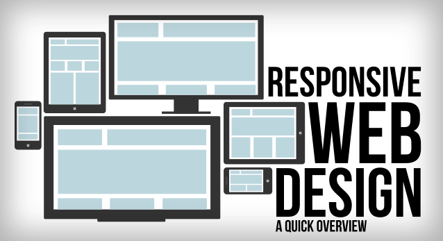
Responsive Web Design is a form of web development that allows websites to “respond to the user’s behavior and environment based on screen size, platform and orientation” (Smashing Magazine). Basically, it’s a way of programming the website to adapt to different browsers and different devices.
With Responsive Web Design, websites can perform consistently on both desktop browsers and mobile browsers. Keep in mind that over 2.6 billion people are smartphone users. That’s a lot of people in need of mobile-friendly Internet.

Having a single responsive website (instead of several different ones) lets you engage your visitors in one place, which saves on Internet real estate and allows for easier tracking.
4. Organize Your Code
The way your code is organized has a tremendous effect on your website’s speed.
Ideally, you should keep CSS code at the top of the page and JavaScript at bottom. CSS is more compact and loads much quicker. Therefore, putting CSS ahead of JavaScript allows you to load your primary content first and your secondary content after. That way, your page can be ready right away.

Use test coverage tools to optimize your code further. These tools allow you to maximize your test coverage using the fewest devices possible.
Keep your website fast and responsive using the tips above. The faster your website is, the greater the chance your customers–and search engines–stay engaged!
