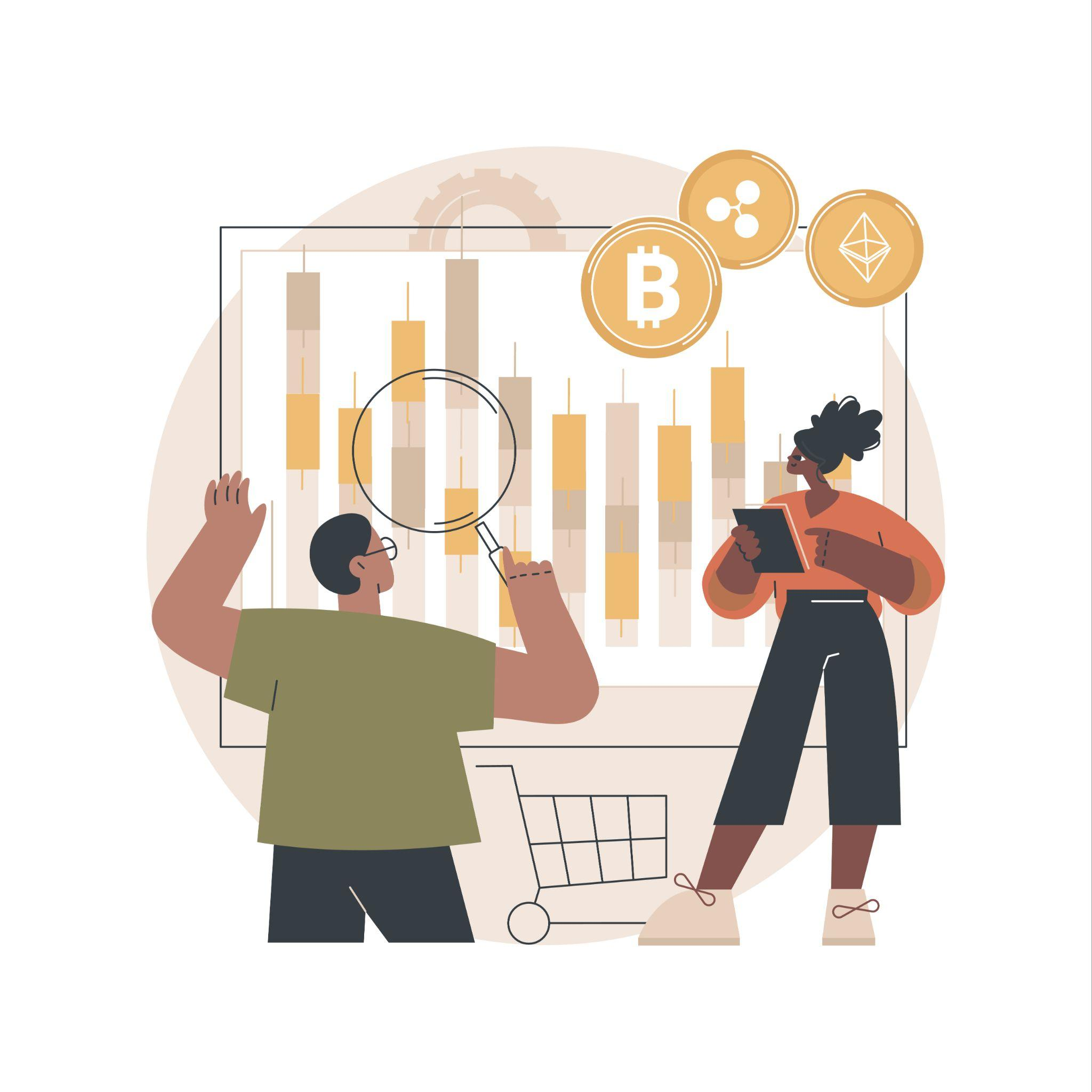
Charts can feel overwhelming at first for anyone new to cryptocurrency. Lines, candlesticks, and sudden price swings all move quickly, but they’re simply a visual record of how a coin’s value changes.
By learning the basics of chart reading, you’ll be able to spot trends, recognize when the market is rising or falling. You can also understand the momentum behind major coins like Bitcoin and Ethereum.
With the fundamentals here, you can easily follow the market and manage your crypto with confidence.
What Are Crypto Charts?
A crypto chart is a graph that shows how the price of a digital currency changes over time. The vertical axis tracks the coin’s price, while the horizontal axis represents time.
Crypto charts show whether a currency such as Bitcoin or Ethereum is going up, down, or staying steady. Most charts also let you adjust the timeframe, such as one hour, one day, or one week.
In general, learning how to read crypto charts is one of the first steps for beginners. It turns raw numbers into a clear picture of momentum, growth, or decline.
Types of Crypto Charts
While there are a few different ways price data is displayed, two chart styles are most common for beginners. They are:
Line Charts
It is one of the simplest chart types. A line chart connects each closing price over time, such as by day or week.
To read one, look at the slope of the line. If it rises, the coin is gaining value; if it falls, the price is dropping. And if it moves sideways, the market is flat.
Candlestick Charts
Candlesticks are the most popular style for traders. Each candle shows the open, close, high, and low price for a set time. Green candles mean the price closed higher than it opened, while red candles indicate that it closed lower.
Compared to line charts, candlesticks reveal more about short-term momentum. They are especially useful once you’re comfortable reading crypto charts in more detail.
Both chart types use the same price data. However, candlesticks provide a deeper view once you’re ready to move beyond the basics.
How to Read Candlestick Charts?
Candlesticks may look complex at first, but each part tells a simple story about price movement. To spot trends and identify market momentum, you need to understand:
The Body
The thick part of the chart candle shows the opening and closing prices for that time period. A tall body indicates a larger price move between the open and close.
The Wicks
The thin lines above and below the body mark the highest and lowest prices reached. Long wicks mean the price moved widely before settling back near the open or close.
Color
Most platforms use green for candles that closed higher (Bullish) and red for candles that closed lower (Bearish). The quick color cue helps you see if buyers or sellers were stronger during that period.
For example, learning how to read Bitcoin charts often starts with candlesticks. They make trends and momentum easier to spot than a simple line chart.
Trends & Timeframes
Crypto charts reveal bigger patterns over time. When prices keep climbing with higher highs and higher lows, that’s a bullish trend.
If they fall with lower highs and lower lows, it’s a bearish trend. Recognizing these directions helps you see the market’s strength or losing momentum.
Another key factor is the timeframe. Shorter charts, like 1-minute or 1-hour, show quick moves but can be noisy.
Longer charts, like daily or weekly, smooth out the action and highlight major shifts. For beginners, daily or 4-hour charts are usually the easiest to follow.
Trends and timeframes matter because they connect directly to your crypto balance. A bullish chart indicates your wallet value is rising, while a bearish chart shows it’s falling.
Even in casino games at https://jackpot.bet/, noticing patterns in wins, losses, or game behavior can guide smarter decisions and improve your overall experience.
Support, Resistance & Volume
When you’re reading crypto charts, you’ll often see prices bounce off the same levels again and again. A support level acts like a floor, where falling prices stop and push back up.
A resistance level is the ceiling, where rising prices struggle to break through. Spotting these zones helps you understand where buyers or sellers may become active.
Most charts also show volume, the number of coins traded during each period. High volume during a big move usually confirms strong momentum.
Conversely, low volume can mean the move is weak or short-lived. Together, support, resistance, and volume give beginners clear signals about the market.
Pro Tip: High trading volume near support or resistance can confirm the level and indicate if a trend may continue or reverse.
Conclusion
Understanding how to read crypto charts gives beginners a clear view of market momentum. By learning the basics of line and candlestick charts and identifying bullish or bearish trends, you can better understand market movements.
Additionally, watching support, resistance, and volume helps you follow the price action of coins like Bitcoin and Ethereum.
Such skills won’t predict the future, but they might help you see where the market has been and where it might be heading.
Frequently Asked Questions
What is Bitcoin chart?
It is a visual graph that shows how the price of Bitcoin has changed over time.
A Bitcoin chart usually displays price on the vertical axis and time on the horizontal axis. It helps you see trends such as upswings, downswings, or sideways markets.
How to read Bitcoin charts?
Start with the basics: a rising line or green candlesticks mean the price is moving up (Bullish), while a falling line or red candles indicate the price is going down (Bearish).
Also, pay attention to timeframes and volume to understand the strength of each move.
Can ChatGPT analyse crypto charts?
ChatGPT can explain how charts work, define terms, and help you understand patterns. However, it cannot provide live analysis, since crypto markets change constantly.
Why is learning how to read crypto charts important?
Reading crypto charts helps beginners make sense of market momentum. Charts turn raw numbers into clear trends that are easier to follow.