
It is 11:30 PM. Your user is lying in bed, holding their phone with one hand, brightness turned down low. They are tired, their attention span is short, and they are looking for five minutes of entertainment before sleep.
In this specific moment, your beautiful desktop-responsive design is worthless. If they have to stretch their thumb to reach the deposit button, or if a white background blinds them, they are gone.

As we approach 2026, the era of “Mobile First” is over. We have entered the era of “Ergonomic Perfection.” User expectations are no longer set by other betting apps; they are set by the fluid gestures of TikTok and the dark-mode comfort of Spotify. To survive, casino product managers need to stop designing for screens and start designing for hands.
Rule #1: The ‘Thumb Zone’ Is Sacred Territory
The most critical real estate in 2026 is the “Thumb Zone”—the arc of the screen reachable by a single thumb while holding a 6.7-inch device. Everything outside this arc is “No Man’s Land.”
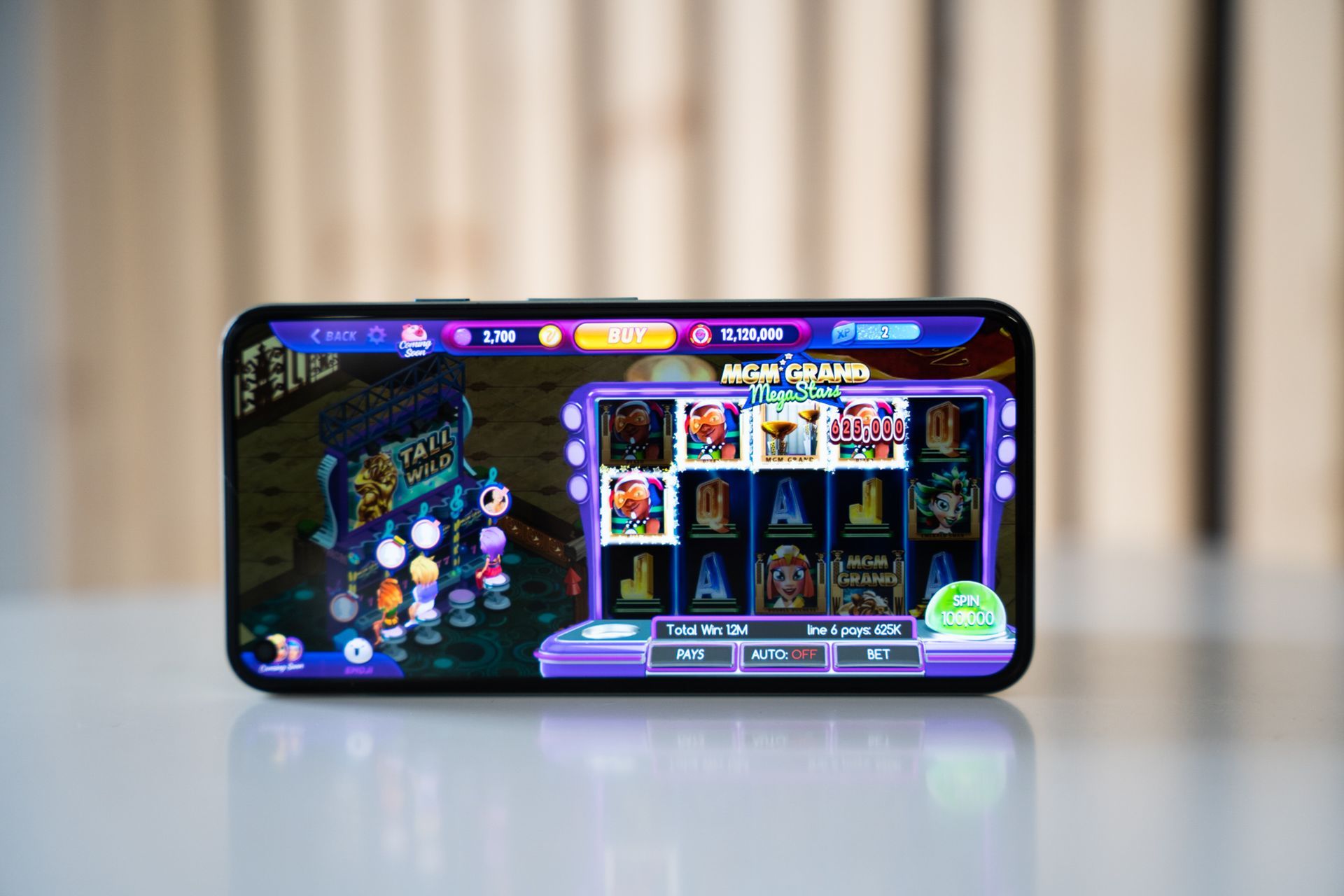
Forcing a user to shift their grip to hit a “Menu” button in the top-left corner is a micro-aggression. It breaks the flow. This is why the classic hamburger menu is dying, replaced by sticky bottom navigation bars that house all core functions: Search, Deposit, and Profile.
We are already seeing this shift in the market’s top performers. Platforms like Fortunica Casino have rigorously optimised their mobile lobbies to ensure that every critical action—from filtering slots to cashing out—sits comfortably within the natural reach of the thumb. They understand that reducing physical friction is the fastest way to increase session length.
Rule #2: Dark Mode is a Health Feature, Not a Style Choice
Dark Mode has graduated from a developer preference to a biological necessity. With OLED screens standard, users demand dark interfaces to save battery and, more importantly, to reduce eye strain during those late-night sessions.
But simply inverting colours is a recipe for disaster. 2026 UX demands “Dual-Theme Assets.”
- Contrast control: Text that is crisp on white often blurs on black. Font weights must dynamically adjust.
- Shadow management: Slot thumbnails with baked-in drop shadows look dirty on dark backgrounds. They need clean, transparent borders.
- The “Trust” shift: The standard “Banking Blue” often disappears on black. It must shift to an “Electric Blue” to maintain visibility and trust.
Rule #3: If It Doesn’t Vibrate, It Feels Dead
Visuals and audio are no longer enough. The third dimension of immersion is touch. Haptic feedback is the only way to communicate with a player without cluttering the UI.
We are moving towards “Haptic Branding,” where specific vibrations communicate specific outcomes:
- The “Near Miss” thud: A heavy, dull vibration when a third scatter misses.
- The “Win” tingle: A sharp, escalating buzz that mimics a coin count-up.
- The “UI” click: A subtle tick when scrolling through a carousel, mimicking a physical wheel.
Rule #4: Swipe is the New Click
The era of the precise tap is ending. The era of the swipe has begun. In 2026, a user should never have to hunt for a tiny “X” to close a window.
- Modal dismissal: Every pop-up or info card must be dismissible with a downward swipe.
- Category switching: Horizontal swipes are faster and more intuitive than tapping small tabs.
- The ‘Pull-to-Bet’: Gamify the interface itself. Replacing the static “Spin” button with a “Pull to Refresh” gesture mimics the physical slot arm and increases perceived agency.
The Evolution: 2020 vs. 2026
To understand how far the bar has moved, look at the difference in standard expectations:
| Feature | Legacy UX (2020) | Future UX (2026) |
| Navigation | Top-Left Hamburger Menu | Bottom Sticky Bar |
| Colour Scheme | Static Light Mode | Dynamic System-Match |
| Feedback | Audio/Visual | Audio/Visual + Haptics |
| Interaction | Tap-Heavy | Gesture-Based |
| Onboarding | Multi-Page Forms | Biometric One-Click |
| Reachability | Two-Hand Assumed | One-Hand Optimised |
Your 12-Month Battle Plan
If you want to future-proof your app, don’t wait for 2026. Start this audit today:
- Heatmap the thumb: Identify any P1 action (Deposit, Spin, Chat) that sits in the “Stretch Zone” and move it to the bottom.
- The dark mode audit: Open your app at midnight with the lights off. Does it hurt? If yes, fix your contrast ratios.
- Haptic nuance: Add vibration to informational feedback (success/fail toasts), not just big wins.
- Kill the ‘X’: Replace close buttons with swipe-down gestures on all modals.
- Biometric speed: Ensure FaceID triggers immediately on app open, removing the “Login” tap entirely.
The apps that win in 2026 won’t just have the best games; they will be the ones that feel like a natural extension of the player’s hand.